Your website shouldn't look like everyone else's
Customers can tell when a site came out of a box, even if they can't say how. That flicker of familiarity quietly costs you trust, and trust is what you're really selling.
On this page
There’s a particular look a lot of websites share now. The big centred headline. The three little cards with icons. The same stock photo of people laughing at a laptop. You’ve seen it a hundred times, which is exactly the problem.
When a visitor lands on a site like that, something registers below the surface. Seen this before. They don’t think it in words, and they couldn’t tell you why, but the feeling is there, and it does quiet damage. A site that looks generic makes the business behind it feel generic too. And generic is hard to charge a premium for.
Looking the same as your competitors is a strategy, just a bad one
If your site uses the same template as the firm down the road, you’ve handed away the one thing a website is good at: making you look like the obvious choice rather than one of several interchangeable ones.
People buy from businesses they trust, and a lot of trust is built in the first few seconds, before they’ve read a word. A site that’s clearly made for you, with your colours, your tone, your photos of your actual work, says this is a real operation that takes itself seriously. A boxed template says we did the minimum. Customers read both, fast.
”But it looks fine”
Fine is the trap. Templates are designed to look fine. That’s their whole job: acceptable for anyone, memorable to no one. Fine doesn’t lose you customers at the door the way an ugly site would. It loses them later, when they’re comparing you to someone whose site felt like more care went into it.
You don’t notice the cost because, again, it’s invisible. Nobody emails to say your site felt a bit samey so they went with your competitor. They just go.
What distinctive actually means
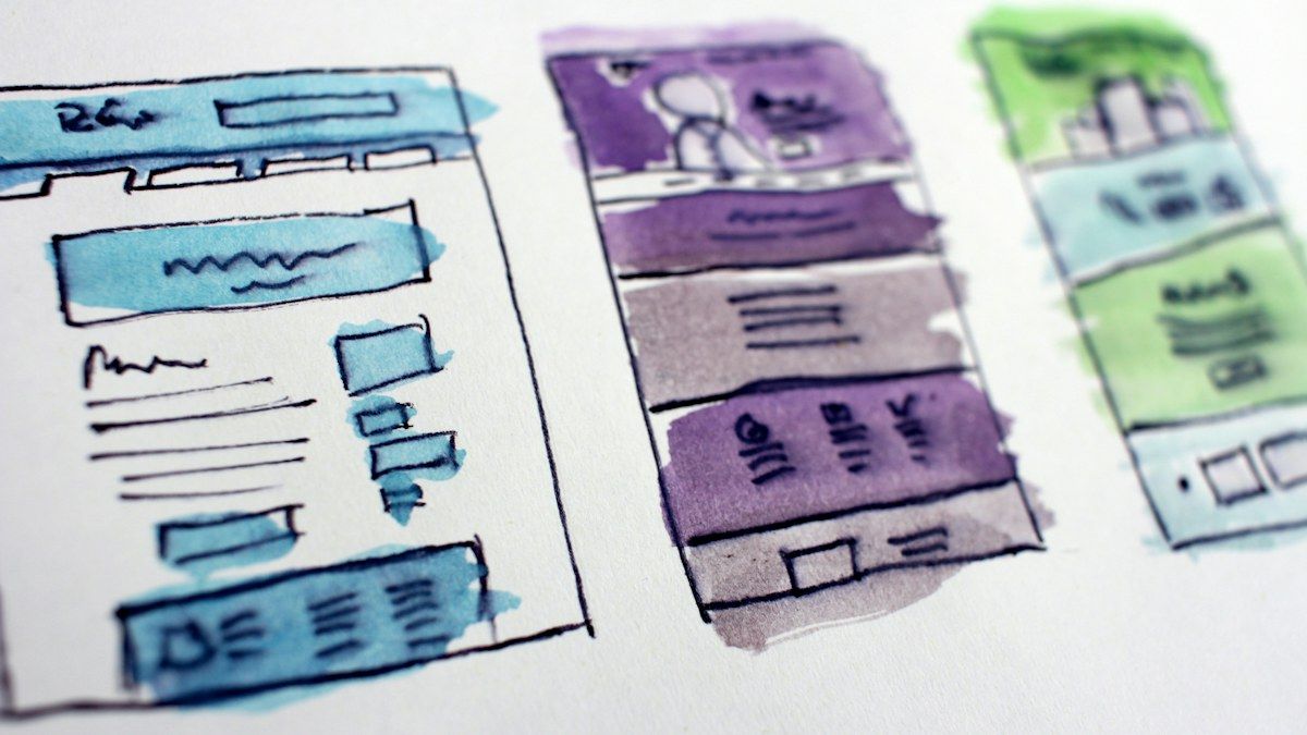
This isn’t about being loud or arty for the sake of it. A distinctive site is one that fits your business and no one else’s. The type is chosen, not defaulted. The layout suits how you actually sell, instead of bending your business to fit the theme. The words sound like you talking, not like every other site in your trade.
It can be calm and plain and still be unmistakably yours. Often that’s the best version. Distinctive doesn’t mean busy. It means considered.
That’s the reason we build by hand rather than from a template, which we get into in why we build sites by hand. When the site is made for you from the start, looking like you is the natural result, not an upgrade you pay extra for.
When samey is fine
If you just need a placeholder up while you get going, a tidy template will do, and we’d rather you were online than waiting. But the moment the site is part of how you win work, looking like everyone else stops being harmless.
If yours feels a bit off-the-shelf and you want it to feel like you, show us what you’ve got.
Work with us
Want a hand with this?
We build the things these articles talk about. Tell us what you're working on and we'll reply within a day, usually sooner.
or email [email protected] or call 07960 849945
Keep reading
All articles →-
-
-